Pivot tables are one of the most powerful features in Excel. Furthermore, they are easy to use once you have learnt how to make them. Once you have mastered how to create a pivot table you will be able to summarise huge amounts of data quickly and efficiently. This tutorial on how to make a pivot table in Excel will teach you everything you need to know about how to make powerful pivot tables. Even if you have never created a pivot table before you will be able to make awesome pivot tables after reading this post.
First, lets find out what a pivot table is in more detail.
What is a Pivot Table?
A pivot table is essentially a data summary tool which is created from a data source. You can summarise data in seconds by simply clicking and dragging fields from one area of the report to another. It can transform hundreds and thousands of rows and columns into meaningful information. You can display subtotals on any level of data you want. Arguably the biggest advantage of using pivot tables is in its interactivity. In fact, you can rearrange information without any effort. As a result, the reason why they are called pivot tables is because you can ‘pivot’ the data in any way you choose.
Why use Pivot Tables?
So why should you use a pivot table? When you have large amounts of data to summarise then a pivot table is the best option to use. If you try and summarise the information with Excel formulas it will be more time consuming. This is because as you have to manually create the formulas. If you add more information to your data then you may have to edit your formulas. This again consumes valuable time and effort.
Pivot tables can easily be formatted to make them attractive and visually appealing. Manually created tables made up of formulas can take longer to format. If there is a large dataset with hundreds of thousands or rows comprising of formulas then this will slow down the Excel calculation time. Whenever you make a change to your data, the formulas will take a while to recalculate. With a pivot table you will not have any problems with slow calculation times.
Pivot Table Layout
There are four components of a pivot table which are contained in the Pivot Table Fields pane. The Pivot Table Fields is a task pane which is associated with the pivot table. By default is located on the right side of the window. The four components of a pivot table are:
- Filters
- Rows
- Columns
- Values

In the screenshot above, there are five fields (Product, Area, Month, Units, Sales). These are the column headings in the source data. Your pivot table appearance and information will be defined by what fields you enter in the four areas of the Pivot Table Fields pane. Now I will explain each area in turn.
Filters
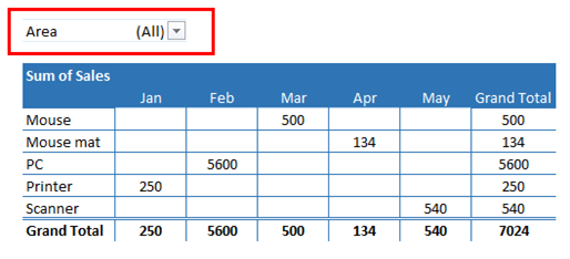
When you move a field in the Filters area you can choose which items in the field you want to see or not see. You do this by checking or unchecking the boxes. They work in the same way as a filter in a table. In the example above, the Area field is the filter.
Rows
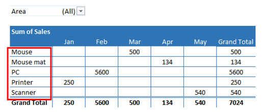
Rows show each item in the field in separate rows. One field item occupies one row. They go down the left side of the pivot table. In the example above, the Product field is in the Rows area. The items in the Product field are displayed in each row.
Columns

Columns show each item in the field across separate columns. In the above example, the Month field is in the Columns area. Each item in the Month field are in separate columns.
Values
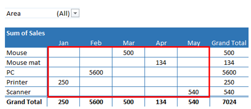
The values shows the summary information. In the example above, the Sales field is in the Values area. The pivot table above summarises the sales by product in the different months. Excel offers many ways to summarise your information such as SUM, COUNT, AVERAGE, MAX, MIN and so on. You are required to enter at least one field in the Values area. You can have the same field in the Values area twice. For example, you can have the pivot table show the sum of sales as well as display the average sales by product and month.
Sample Data
So now you know what pivot tables are, why they are used and the how the layout works. In the next section you will learn how to make a pivot table in Excel. You can follow along by downloading the sample data used in the below instructions.
How to Make a Pivot Table in Excel

The source data above shows the sales of furniture and the number of units sold by four Sales people. The Sales people are Jim, Sally, Lisa, John. I will use this source data to create a basic pivot table. If you haven’t already done so, you can follow along by downloading this sample data here.
1. Specifying the Source Data
The first thing you need to do is to specify the data to make the pivot table. To do this follow these instructions:
- Select any cell in the data range. Click on the INSERT tab in the ribbon and then under the Tables group select the PivotTable command button

- The Create PivotTable dialog box will appear. Excel will attempt to specify the correct range of the data based on the active cell. If for any reason Excel doesn’t specify the correct range, then you can use your mouse to select the data range. In this example, I selected the range A1:F22. The data range will appear in the Table/Range field

2. Specifying the Location of the Pivot Table
The next step is to specify where you want the pivot table to be located. You can specify whether to have the pivot table in a new worksheet or in the existing worksheet. You do this from the Create PivotTable dialog box. In this example, I have selected New Worksheet. If you want the pivot table in the existing worksheet then select Existing Worksheet. You can then specify the cell in the Location field. Once you have done this click the OK button.

Excel creates a blank pivot table. In my example, it creates one in a new worksheet and also displays the Pivot Table Fields pane.

3. Adding Fields to the Pivot Table
You now need to build the pivot table. You do this by moving the fields in the Filters, Rows, Columns and Values area of the Pivot Table Fields pane. In this example, I want to show the sales by product and sales person. You can move the fields into one of the four areas by using one of the following methods:
- Clicking and dragging the fields to one of the four areas.
- Right click the field name and choose one of the four areas in the shortcut menu. You can choose from Add to Report Filter, Add to Row Labels, Add to Column Labels or Add to Values.
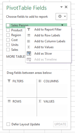
Select the check box against the appropriate field. Excel will do its best to move it to the correct area. For example, when I checked the Sales Person field it correctly moved it to the Rows area. Whenever you check the box for a field that contains values then Excel will move it to the Values area. Excel may move the field to an area you don’t want. If so, then simply do one of the first two options to move it to the correct area.

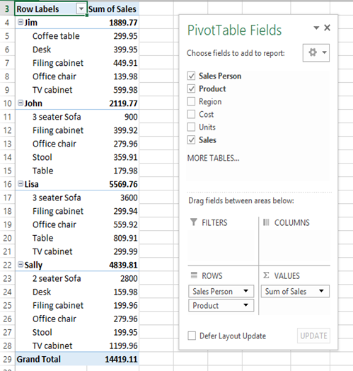
In the example below, I have created a pivot table which shows what furniture items each Sales person has sold. It also shows the amount sold for each furniture item. There is also a subtotal which shows the total sales sold by each Sales person.
The Sales person and Product fields are in the Rows area of the Pivot Tables Fields pane. The Sales is in the Values area.
Reorganising the Pivot Table
Once you have created the pivot table it is very easy to change it around to show different information. By pivoting the fields you can answer different questions and look at different trends and patterns. To move the fields in a different area in the Pivot Table Fields pane just click and drag the field to another area. You can also right click the field and select one of the options in the menu as described in the previous section. In this section, I will show you how easy it is to modify your pivot tables to show different summary information.
Show Sales for East Area Only
In the below example, I want to see all the sales for the East area only. For this reason, I put the Region field in the Filters area of the Pivot Table Fields pane. As a result, the filter will now display above the pivot table. I then just checked the East check box and unselected the other check boxes and then pressed the OK button.

The pivot table now just displays information relating to the East area only.

Show Total Sales by Furniture Item
In this example, I just want to see the total sales for each furniture item. I therefore removed the Sales Person field by clicking it and dragging it away. The pivot table now displays the total sales for each furniture item. You can make this more meaningful by sorting the sales in descending order. By doing this you can easily see which furniture has made the most sales through to which has made the least sales.

Show Sales by Area
In this example, the pivot table displays the furniture items sold in each area and the total sales by area. I put the Region field in the Columns area of the Pivot Table Fields pane. Each area is now a column heading. The Product field is in the Rows area so each furniture item occupies a row. The Sales is the Values area of the Pivot Table Fields pane.

This tutorial on how to make a pivot table in Excel has given you a good understanding of building pivot tables. By following along using the sample data provided and with some practice you will become proficient in using pivot tables.
I hope this post has given you a good taste for pivot tables and that you want to learn more about them. For example, you may want to learn how to format and customise pivot tables. Maybe you want to learn how to sort pivot tables so they become even more meaningful. Alternatively, you may need to merge data from other tables into one large dataset to create a pivot table. In which case, the VLOOKUP function will be handy in this situation. Whatever the reason, if you want to know more then I urge you to read the next section.
Learn More About Pivot Tables
Are you interested to learn more about how to make pivot table in Excel? If so, I have written a book about this subject. The book is called Excel Bible for Beginners: The Step by Step Guide to Create Pivot Tables to Perform Excel Data Analysis and Data Crunching. It is available on Amazon in paperback and Kindle format. You can also purchase the book in eBook format from this website shop.
In this book you will learn how to customise and format your pivot tables so they look more professional. You will learn how to sort, filter and group pivot tables and how to use calculated fields and calculated items. You will also learn how to reference pivot tables to perform calculations and how to use slicers to dissect your pivot tables. If you want to create charts from pivot tables then this book will give you step by step instructions to create awesome looking charts. There is also so much more you will learn about pivot tables in this book.

Here are some of the reviews from people who have purchased this book:

To learn more about this book and to purchase it from Amazon, then simply click one of the buttons below.
I hope you enjoyed my post on how to how to make a pivot table in Excel. I would really appreciate your feedback and comments on this tutorial. If you have any feedback or questions then please leave a message in the comments section below. I am always grateful to hear from my readers.


This is a very intriguing post, I was looking for this knowledge. Just so you know I found your web site when I was searching for blogs like mine, so please check out my site sometime and leave me a comment to let me know what you think.
Thank you for your comment. I hope you are now able to create pivot tables from reading this post. If you have any questions then please do not hesitate to contact me.