
In this tutorial, I will show you how to make a histogram in Excel using two different methods. A histogram is a chart which groups the data points into user specified ranges. It looks very similar to a bar chart and it condenses data series into an easy to understand visual by taking many data points and grouping them into logical ranges or bins. The x axis buckets a range of outcomes into columns. The y axis is the count or percentage of occurrences in the data for each column and used to visualise data distributions.
People who work in statistics normally use histograms and it shows how many times a certain variable occurs within a specified range. For example, suppose you send out a questionnaire asking for the ages of the people who have filled in the questionnaire. You may, for instance, want to create a histogram which shows the number of people within the age ranges of 18-27, 28-37, 38-47, 48-57, 58-67 who have filled in the questionnaire.
I will now show you two different methods of how to make a histogram in Excel. The first method will show you how to make a histogram using Excel 365 or Excel 2016 onwards. Secondly, for those of you who don’t have Excel 2013 or older, the second half of this tutorial will show you how to make a histogram using the FREQUENCY function.
How to Make a Histogram in Excel 365
Before Excel 2016, you didn’t have the option to choose a histogram in the charts section of the ribbon. As a result, this made making a histogram a little more difficult. Luckily, Excel 365 and Excel 2016 introduced the histogram chart as one of its default chart options and therefore you can create one very quickly.
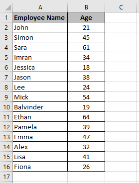
To make a histogram in Excel, I will use the above dataset which shows a list of employees working in a company along with their ages.
Here are the steps to create a histogram in Excel.
- Select the entire dataset. In this example, I have highlighted the range A1:B16

- Click on the Insert tab in the ribbon. Under the Charts group select Insert Static Chart and then select the Histogram chart icon
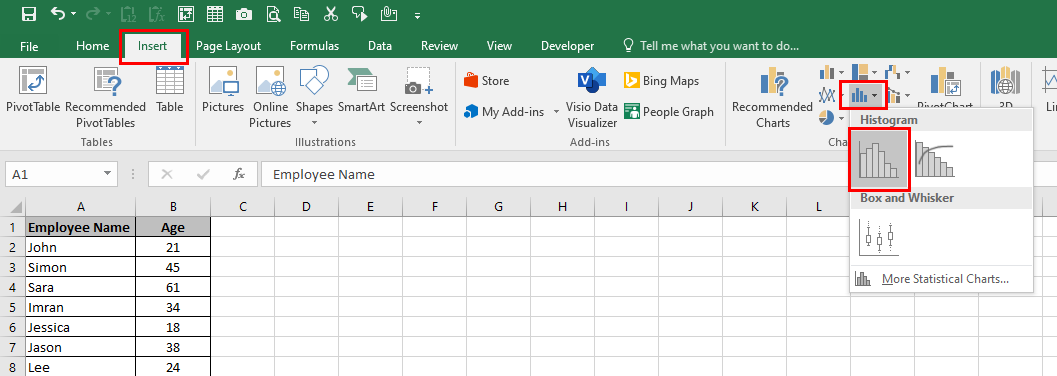
- This will insert the histogram in the worksheet

- Now you can format the histogram. Right click the vertical axis and select Format Axis
- The Format Axis options pane will open on the right where you can select different options to customise your histogram

Here are what the different categories mean:
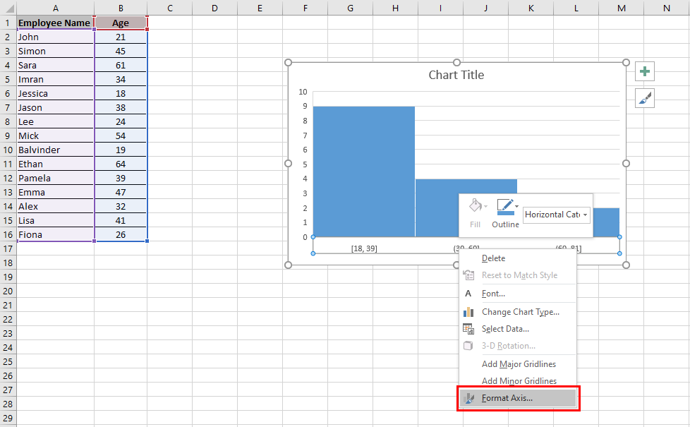
By Category: Use this option when there are repetitions in categories and you want to know the sum or count of the categories. This option is not relevant in this example as the categories are all different because the employees all have different names.
Automatic: Excel will automatically decide what bins to create. In this example, Excel decided to have 3 bins in the histogram chart. These are 18 to 39, 39 to 60 and 60 to 81.
Bin Width: With this option, you can decide how big the bins should be. For example, in the histogram chart above, the bins are 21.

In the above example, I have changed the bin width to 10. As a result, the number of bins has increased from 3 to 5.
Number of Bins: Here you can specify the number of bins you want and Excel will automatically create the histogram chart with that many bins.

In the above example, I have changed the number of bins to 4 and as a result, the chart now shows 4 bins.
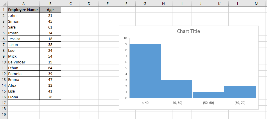
Overflow Bin: If you want to group values above a certain number together then you can use this option. For example, if I want to know how many employees were over 40, then I enter 40 in the Overflow bin field.

In this example, you can see that I have grouped all the values over 40 together. The last bin is now showing >40.
Underflow Bin: This is very similar to the Overflow bin but this option groups values below a certain number.
In this example, I entered 40 in the Underflow bin. As a result, this has grouped all ages below the age of 40 together.
Once you have customised the histogram chart as per the above settings, you can further format it by changing the chart title, adding axis titles, changing the chart design etc. To learn how to do this, you can see my post on How to Make a Chart in Excel: How to Create a Chart in Excel in 3 Easy Steps.
Using the FREQUENCY Function
If you don’t have Excel 365, Excel 2016 or newer, then you can make a histogram in Excel with a formula using the FREQUENCY function. The FREQUENCY function calculates the frequency of each value within a range. The FREQUENCY function is an array formula so you have to press Control + Shift + Enter on your keyboard.
The syntax of the FREQUENCY function is:
=FREQUENCY (data_array, bins_array)
The data_array argument is the values for which you want to get frequencies.
The bins_array argument is the intervals (bins) for grouping values.
A big advantage of creating a histogram with a formula is that it is dynamic which means it instantly updates when the data changes. Now I will show you how to make a histogram in Excel using the FREQUENCY function.
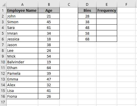
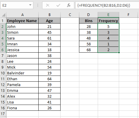
I will use the same dataset I used in the previous example of how to make a histogram in Excel 365. In the range D2:D6, I have entered the bins. In the range E2:E6, I want to enter a formula to see the frequency of the bins. For example, in cell E2, I want to see how many people are aged 28 and under. In cell E3, I want to see how many people are aged between 29 and 38 and so on.
Here are the steps to make a histogram in Excel using the FREQUENCY function.
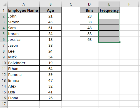
- Highlight the range E2:E6
- Enter the formula =FREQUENCY(B2:B16,D2:D6) in the Formula Bar

- Press Control + Shift + Enter on your keyboard. The frequency is now populated in the range E2:E6. Notice the curly brackets before and after the formula { }. This means the formula is an array formula
- You can now create a histogram chart by simply creating a column chart
Learn how to make Excel Charts
To learn more about Excel charts, then please see my tutorial on how to make a chart in Excel. In this tutorial, you will learn the following:
- The different charts available in Excel
- How to make an Excel chart in 3 easy steps
- How to format your charts in quick easy steps
To check out this tutorial then please just click here.
I hope you enjoyed this post on how to create a histogram in Excel and found this tutorial helpful. Please leave a comment below if you have any feedback or if you know of any other ways to make histograms in Excel.

I was able to find good info from your articles.
Thanks for your comment. I am glad you found this tutorial helpful. If you have any questions about this tutorial or anything else on this website then please let me know.
Hi, I found your article by mistake when i was searching internet for this issue, I have to say your content is in fact helpful I also love the theme, its amazing!. I dont have that much time to check out all your post at the moment but I have saved it and also add your RSS feeds. I will be back in a day or two. thanks for a great site.
Thank you for your comment. I am happy you find my content helpful. If you have any questions then please do not hesitate to ask.
Very nice write-up. I absolutely appreciate this site. Stick with it!