Charts in Excel are a great way to visualise your data. Sometimes a worksheet may contain thousands of rows of data which would be impossible to make sense of. Creating a chart in Excel will make your data set more visually interesting to your audience and consequently be able to easily pick out key points from it. This post will teach you how to make a chart in Excel quickly and easily.
Different Types of Excel Charts
Excel provides a number of charts you can choose from. It is important to choose the chart which will present your data in the best possible way. Below are the most common Excel charts that people use to interpret data.
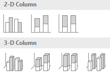
Column Charts

Column charts have vertical bars to present the data. They are very versatile and used for most types of data.
Bar Charts

Bar charts are like column charts but the bars are displayed horizontally rather than vertically.
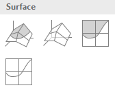
Surface Charts

Surface charts are useful when you have a large data set. They are useful when you want to find the optimum combinations between two data sets.
Line Charts

Line charts are useful when you want to analyse trends. The lines are connected to data points so you can easily see if the trend is going up or down.
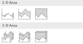
Area Chart

Area charts are very similar to line charts however, the difference is that the area under the lines are filled in.
Combo Charts (Only available in Excel 2013, 2016, 2019 and 365)

Combo charts are useful if you have a data set arranged in columns and rows. Combo charts are like combining two charts into one hence the name.
Pie Charts

Pie charts are useful if you want to compare portions. Each value is shown as a slice of a pie. If you have data which is arranged in a row or column then a pie chart is a good option.
Scatter Charts

Scatter charts are typically used for scientific, statistical and engineering data to show and compare numeric values. Data that’s arranged in columns and rows can be plotted in a scatter chart.
Radar Charts

Radar charts compare the aggregate values of several data points. If data is arranged in columns and rows then you can use a radar chart.
Stock Charts

Stock charts can show fluctuations in data such as stock prices, daily rainfall or annual temperature. You have to ensure the data is organised in the right order. Data must also be arranged in columns and rows in order to use stock charts.
How to Make a Chart in Excel

I will now show you how to make a chart in Excel. All the charts you can choose from are in the INSERT tab under the Charts group in the Excel ribbon as shown in the screenshot above.

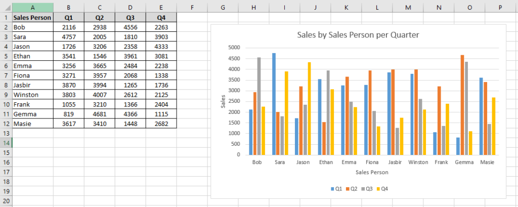
The data in the screenshot above shows a list of Sales people with their sales in Q1 to Q4. If you look at the data table as it is, it is hard to determine who has the best sales each quarter. It is therefore best to create a chart to visualise this information.
To create a chart from this data just follow these steps:

1. Select all the data, including the headings

2. Select the chart you want to use in the Charts group. Excel can help you with selecting a chart. If you hover your mouse over each chart for instance, Excel will display what the chart will look like in the worksheet. In this example, I have chosen the 2D clustered column chart

3. The 2D column chart is now embeded in the worksheet
How to Resize Charts in Excel

You can resize the chart by clicking it to make it active and then using the resize handles on each side of the chart to make the chart bigger or smaller. For example, click and drag the mouse up or down on the top or bottom edge to make the chart taller or smaller. Also, click and drag the mouse left or right on the side of the chart to make it wider or narrower.
Using Excel’s Recommended Charts to Make a Chart in Excel

If you are not sure what chart to use, then Excel offers you recommended charts specific to the data in the worksheet. To use this tool, select your data and then press the Recommended Charts command button which is located in the INSERT tab under Charts group.

You can then choose from a list of charts Excel recommends to you on the left hand pane.
How to Format Charts in Excel

When you have created the Excel chart, it may not be in your desired formatting. You may want to add a chart title, axis titles, change the colour and so on. Fortunately, Excel offers various formatting options to enhance your chart. This is all done in the Chart Elements. Select the chart to activate the Chart Elements and then click the plus sign (+). You will see various formatting options which you can turn off and on by checking or unchecking the appropriate boxes.
Changing the Chart Title

Your chart will by default have a title called ‘Chart Title’. To have a more descriptive name, just click inside the chart title and over type the text to the title you want. In this example, I have named the chart title ‘Sales by Sales Person per Quarter’. If you don’t want a chart title then simply uncheck Chart Title in the Chart Elements.
Adding Axis Titles

Your chart by default will not have axis titles. Axis titles are useful to make your axis more descriptive, thus easier to understand. To add axis titles, check Axis Titles in the Chart Elements. The axis titles will have a default name ‘Axis Title’. You can click inside the axis titles and type a more descriptive name. For example, in the screenshot above, I have named the x axis ‘Sales Person’ and the y axis ‘Sales’.
Changing the Chart Style

You can choose from one of Excels pre-formatted chart templates to format your chart quickly and easily. This tool is located in the DESIGN tab under the Chart Styles group. You have to activate the chart first by clicking it. When you select a chart style, the font style, font size, and chart colour will change depending on what chart style you have chosen. Data labels are displayed, again depending on what chart style is chosen. For example, I have chosen chart style 11 in the screenshot above.

You can also change the chart style by clicking the Chart Styles button when you activate the chart. This button is located under the plus sign (+) and has a paintbrush in it. This contains the same chart styles as the ones under the DESIGN tab.
Changing the Colour Scheme

You can also change the colour scheme of your chart quickly and easily. To do this activate the chart and then press the Chart Styles button. Click on the tab called COLOR and then choose from a choice of colour schemes.
Change the Position of the Legend

The legend by default, will be displayed at the bottom of the chart. I prefer to have this at the top. To change the legend position, activate the chart and ensure that Legend is checked in the Chart Elements. Click the arrow to the right where a sub menu will appear and then select the position where you would like it to be in the chart. In this example I have selected Top.
How to Switch Rows and Columns in Charts

You can switch the rows and columns if you wish. As a result, the data on the x axis will be displayed on the y axis and vice versa. To do this you have to activate the chart and then press the Switch Row/Column command button which is located in the DESIGN tab under the Data group.
When I press the Switch Row/Column command button the x axis now displays the quarters and the Legend displays the Sales people.
How to Change Chart Type

Sometimes you may decide that the chart you have selected is not the one you want. You can easily change the chart and keep the data within it as well as the chart and axis titles. To do this, you have to activate the chart first and then click on the Change Chart Type command button which is located in the DESIGN tab under the Type group.
When you press the Change Chart Type command button the Change Chart Type dialog box will appear where you can choose from any chart you want. In this example, I have chosen the Bar chart. After you have selected a chart press the OK button.

Learn How to Make a Histogram Chart
I have also written a tutorial on how to make a histogram chart. This Excel tutorial will teach you how to make histogram charts using two different methods. To learn more about this then please click here.
Thank You for Learning How to Make a Chart in Excel from this Tutorial
Thank you for reading and I hope you enjoyed this tutorial on how to make a chart in Excel. This tutorial gives you the foundations and the building blocks of how to create an Excel chart quickly and easily. Once you have mastered this, then you are well on your way to create more advanced Excel charts. A good site to learn how to make more advanced Excel charts is from a website called Trump Excel. You will learn how to create advanced charts such as target charts, milestone charts, sales funnel charts, bullet charts, waffle charts and many more. You can check out the website by clicking here.
If you have any questions or feedback then please leave me a comment below.
Sip and Spreadsheet: The Perfect Excel Mugs for Data Enthusiasts!
Ready to add a touch of Excel magic to your daily routine? Our Excel mugs are designed to elevate your experience. Whether you’re a spreadsheet wizard or just love a good cup of coffee in style, these mugs are the perfect choice. Elevate your daily caffeine fix and showcase your passion for Excel. Click the links below to explore our collection and make every sip a data-driven delight!
Etsy Shop: API reponse should be HTTP 200API Error Description: Shared secret is required in x-api-key header.


Thank you for this post. This is a really comprehensive post on Excel charts. What is the better chart to use, line chart or bar chart?
Hi Gemma,
Thanks for your comment. You need to choose the chart that best conveys the data. Line charts are useful for displaying small changes in a trend over a given time. Bar graphs are better for comparing larger changes or differences in data among groups.
I hope this helps.